Strava's Record an Activity flow is the highest-frequency action in the product and the one most exposed to context. People start a recording while standing at a trailhead, adjusting an armband, or leaving a gym - not sitting still and reading the screen. That context turns small interface decisions into real failures, which is why I picked this flow over onboarding, the social feed or segment discovery.
A heuristic evaluation will always produce findings. Deciding which ones deserve engineering time is the actual work, and that is what this is about.
Scope, and what this method cannot tell you
The evaluation covered the iOS app only, across four stages: entry from the home tab, pre-recording configuration, live recording, and the Save Activity form. Onboarding, the social feed, segment discovery, and subscription features were out of scope.
ASSUMED No user testing or quantitative data was collected. Every severity rating in this evaluation is expert judgement against established principles, not a measured failure rate. A heuristic evaluation tells you where a product violates a known principle. It cannot tell you how many users that violation actually costs.
I decided to state that limit up front rather than bury it, because it changes how the recommendations should be read. These are hypotheses about friction, prioritised by reasoning. The right next step for most of them is instrumentation or a test, not a direct ship.
What the walkthrough surfaced
Each screen was assessed twice - once holistically to understand the intended design, then systematically against Nielsen's ten usability heuristics and three UX laws.
Severity is defined by exposure, not by how annoying the problem feels. High means every user meets it on every recording session. Medium means it hits a specific moment or a subset of users. Low means it is real and minor. That rule is what lets the ranking survive someone disagreeing with my taste.
| Issue | Heuristic violated | UX law | Impact |
|---|---|---|---|
| Record button is low-contrast and off-brand | Consistency and standards | Jakob's Law | High |
| No buffer between tapping Start and recording | Error prevention | Fitts's Law | High |
| Activity type selector is easy to overlook | Match between system and real world | Jakob's Law | High |
| Pre-recording sheet surfaces five options at once | Aesthetic and minimalist design | Hick's Law | Medium |
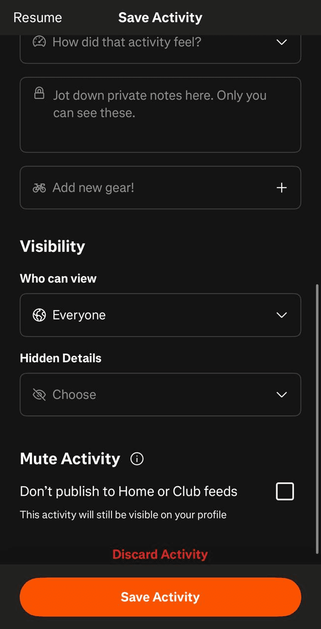
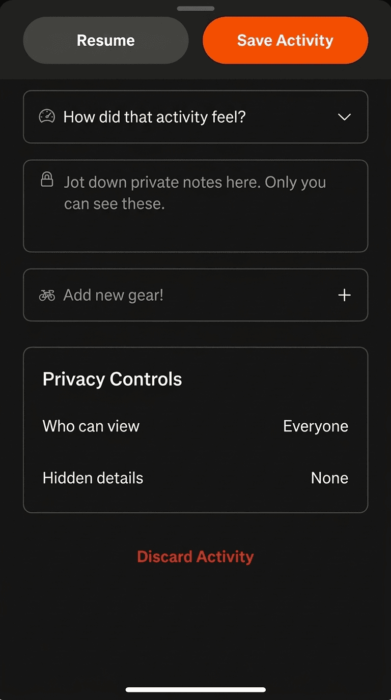
| Privacy controls scattered across the Save screen | Consistency and standards | Law of proximity | Medium |
| Resume and Save sit at opposite ends of a long scroll | User control and freedom | Fitts's Law | Medium |
| Add Route reads as disabled or secondary | Visibility of system status | Hick's Law | Low |
Two findings are worth expanding, because they are the ones where the heuristic framing led somewhere a surface read would not have.
Fitts's Law cuts both ways on the Start button
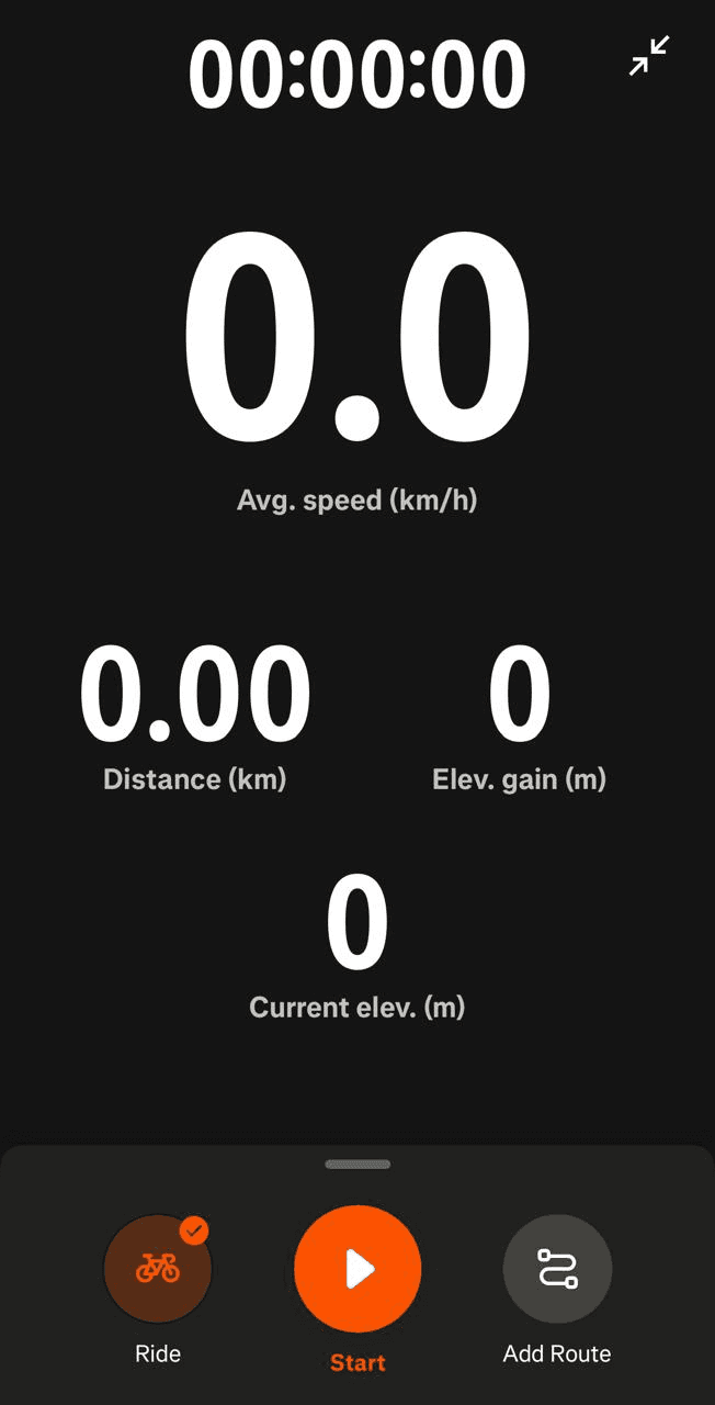
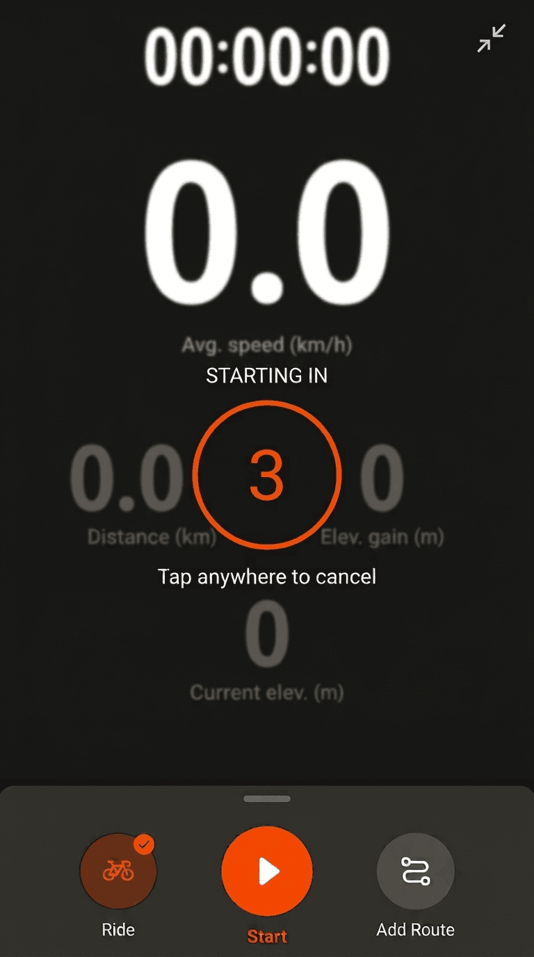
The standard reading is that a large, central target is good design - it is fast to hit. That is true, and it is also exactly why accidental recordings happen. The same property that makes the button easy to hit deliberately makes it easy to hit by mistake, in a context where the phone is being handled rather than read.
The fix is not a smaller button. It is a three-second countdown with a visible cancel target, a pattern people already know from camera apps and interval timers. It preserves the speed and adds the intent signal.
The cluttered sheet and the missed activity type are the same problem
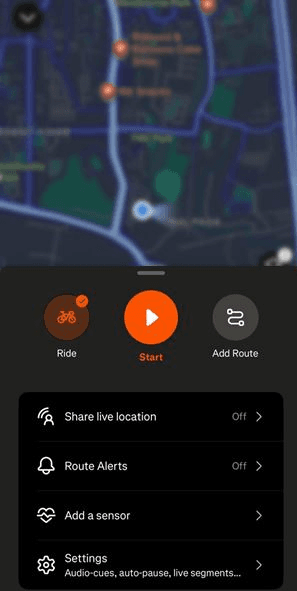
Separately, they look like a density issue and a hierarchy issue. Together they form a causal chain: because the sheet surfaces five options at once, frequent users learn to ignore the whole sheet, and the activity type selector lives inside it. Users who have trained themselves past the clutter have also trained themselves past the one control that matters.
That is why progressive disclosure and elevating the activity type belong in the same change, not separate backlog items.

How I sequenced the fixes
Seven findings is not a plan. I ranked them on expected user impact against implementation cost, and drew the line after three.
The first sprint is the countdown timer, an explicit activity type confirmation, and brand-consistent styling on the Record button. These three affect every user on every recording session, are mutually independent, require no architectural change, and carry low regression risk. They can ship together without coordination overhead.
The second group - progressive disclosure in the bottom sheet, consolidated privacy controls, and a sticky Resume and Save bar - all touch layout and information architecture on two specific screens. They are more invasive and more arguable, which makes them the right candidates for A/B testing against session-start speed and activity completion rate rather than shipping on judgement alone.
Add Route stayed unranked. It is a real finding and a minor one, and saying so is more useful than padding a roadmap with it.
The recurring theme across the findings is that Strava's Record flow is well-built but optimised for the user who is already sitting still and paying attention. Nearly every issue appears at the moment the user is least able to read carefully - starting a workout, or ending one. That is the pattern worth fixing, not the seven items individually.
What I'd do differently
The evaluation would be stronger with even a small round of moderated testing on the pre-recording stage specifically, since that is where my confidence is lowest - I am inferring that users miss the activity type selector from its visual treatment, not observing it. If I were doing this inside a product team, I would also want the accidental-recording rate from analytics before committing to the countdown, since that single number would either justify the fix immediately or kill it.
I would also treat the mockups as what they are. They communicate the proposed change clearly enough, but they are illustrations rather than specifications - no states, no measurements, no edge cases. A real handoff needs the empty state, the error state, and what happens when the countdown is cancelled halfway.